
Bernadette Ballantyne
WINDOWS TO THE SOUL Gaining her Bachelor of Fine Art at Whanganui Quay School of the Arts (now Whanganui UCOL) between…

WINDOWS TO THE SOUL Gaining her Bachelor of Fine Art at Whanganui Quay School of the Arts (now Whanganui UCOL) between…

ARTISTIC ESCAPE Diagnosed in 2018 with Fibromyalgia and FND (Functional neurological disorder) Monique Tichborne bravely started to use art as a…
CLASSIC BEAUTY Livia Dias is an artist who enjoys painting nature, gardens and people. Livia grew up in an environment surrounded…

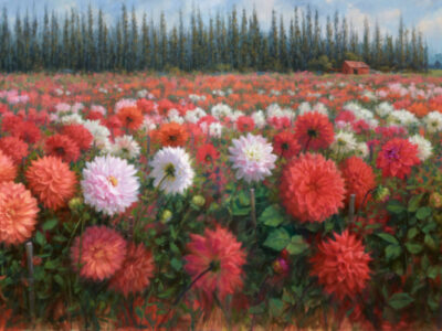
FREE SPIRIT Rebelling about being told what and how to paint, and being a free spirit, travelling from place to place…

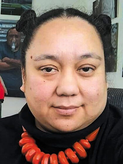
 MY HAPPY PLACE
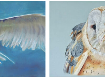
Born in England and sharing her time between Australia and New Zealand, Siobhan completed two years at Gold Coast Art School between 2011 and 2013. When she moved to Russell Island, she saw a notice on the board at the ferry terminal, advertising a workshop with New Zealand Master Pastelist, Maxine Thompson, which she promptly signed up for and has never regretted.


Ken’s inspiration, he says, is mostly to do with the creation of an image, rather than trying to convey some political message. “I really enjoy the realism but I did an abstract course some years ago and I now also enjoy developing the realistic image into a more abstract form. I have entered some of these paintings into the Howick Art Group’s annual competition and they have taken 1st prize. One of the judges, Evan Woodruff, said that the work was more abstractionism than pure abstract.”
IMMERSIVE DETAIL “I love when an idea in my head comes to life on paper and translating that idea into a…
HOW COULD I NOT? Born into a creative family with parents who belonged to a vibrant arts community, Adair Davis tells…

“I’ve grown up around creatives so it was a natural transition for me to make art my career. As a young person I remember wanting to become an artist so I didn’t have to talk to people. I was fearful of having a job in front-of-house, reception, or serving in a shop. Anything to do with people I didn’t want to do. Well, I’ve come a long way in thinking from back then.”


By Tim Saunders
“Growing on top of the henge (earthen bank), their intertwined roots have been exposed by soil erosion, caused by a combination of weathering and visitors feet. The resultant lattice is fascinatingly ornate and well beyond the scope of my knife work. Brushes didn’t seem to hold the answer either; the magic that I was reaching for didn’t seem to be present in a realistic depiction. I tried several approaches, including a diversion into a stylised use of colour that took on a life of its own for a while but it wasn’t until I reached back in time for my pen and its promise of crisply rendered detail, that I realised that colour itself might be the problem. It seems to be well known among photographers that a sharp monochrome photograph will show detail better than any colour photograph could. The reason for this has nothing to do with any inherent superiority of black and white film over colour; it holds true in digital photography. It is simply that colour distracts the eye from detail and it seems that our brains can only cope with so much visual information at a time.
You cannot copy content of this page