
You’ve bought a masterpiece, or you are hanging one of your own works. Why is it always so intimidating to look at a blank wall and decide where to hang it?
If furniture doesn’t look as if it is in the right place, it’s easy to pick it up and move it somewhere else. It doesn’t involve technicalities like which hook to use, is this a load bearing area, am I going to make a hole in my wall, which I am going to have to laboriously repair? ‘How to hang pictures’ is a Google search worth doing, but the variety of tips are incredible — from simple to complex, there’s something for everyone in the 87,000,000 odd results it turns up.
From galleries offering advice that don’t necessarily work with your home space, right through to mock-ups with paper cut-outs, there’s a world of debate on how you do or do not hang your artwork. Some say the answer is simple – one hangs artwork exactly at a 57”-(1.44 metres) high.
There is no perfect answer, but there are a lot of considerations. We have listed some of them below.
57” Centre Rule
Although most research brings up the 57” centre rule (‘On cenre’ means that the middle of the artwork is always at 57”), we feel it’s a little generic and doesn’t always work. Your surroundings and even your body’s height are influencing factors for your collection of images. When you have larger works and furniture to consider, 57” is not always practical.
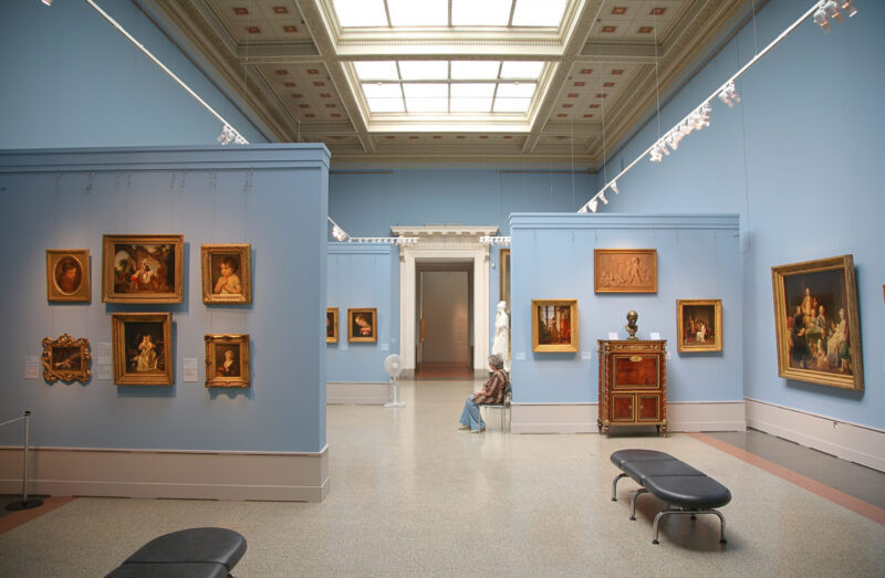
For the most part, we’re told to hang art at ‘eye level’.
Whose eye level? Yours.
We have found another rule and it’s served us well. Over a sofa or sidetable, it is better to hang the work lower. Arguably, when seated, it’s just slightly above ‘eye level’ then. Assess your furniture, wall space and personal gazing stance. It’s always a great idea to have a second opinion, and that way, you have someone to hold the work in place while you stand back and evaluate the position.
Grouping artwork
Maxwell Ryan – www.apartmenttherapy.com – has these six suggestions for you to try:
• Choose your centre pic – it doesn’t need to be the biggest, but it does need to have some size.
• The centre pic should be precious and needn’t attract the most attention on its own.
• Move – generally – from large to small as you move to the perimeter.
• Always allow for more weight or mass on the left (it’s just a rule of optics).
• ‘Weight’ means either darkness, size or thickness.
• When you have your assembly set on the floor, hang from the center pic outward.
Mocking up of same-size paper cut-outs is a good way to see how the spacing you have decided on will work. For people who need more for visualising when hanging their artwork, moving paper mock-ups around until you like the balance or weight of frames is also way to get a sense of your arrangement.
Vary the Scale
Candy Spelling – www.candyspelling.com – has this to say about grouping artwork. “Groupings of art are especially eye-catching when you mix contemporary and traditional pieces, or hang photographs and drawings alongside paintings. That said, I like to have a consistent element that subtly ties it all together – that could mean matching frames, art with similar subject matter rendered in different media and styles, art in a single general palette, or surrounding all the pieces with a couple of inches of white matting.”
Try mixing small and large pieces, or small and large-scale images. In other words, if you love nature images, rather than doing all landscapes, mix in some close ups of the natural world. Love portraits? Try mixing together full-length images of people with upper-body or head shots.
Keep in mind that bold, brightly colored, and/or large pieces will ‘read’ well from a distance. A living room or family room would be a good place to display them. Such works, when seen through a doorway or at the end of a hallway or passage, can draw the viewer into the next space. Artwork which is subtle, small, or contains fine details is best appreciated in an intimate setting where the viewer will be ‘up close and personal’ – in a bedroom, study or near a desk or dressing-table, perhaps.
Don’t take the leap without laying all your grouped works on the floor to get a sense of the impact and cohesion. It’s worth taking a little time here to try all the different placements for each work, until you love the way it looks. If you like it on the floor and take the time to get the layout right, you’ll love it on the wall.
Tips on placing
Lighting is an important consideration. No artwork of any kind should ever be hung where direct sunlight will fall on it. The high energy of sunlight will fade the art and weaken its paper or other supports. Fluorescent light also contains a large amount of the most damaging frequencies of light. Fortunately, there are new glazing products which filter out 97% of the most harmful part of the spectrum, helping to protect against such exposure. Sometimes it is difficult to avoid reflections of lamps, windows, or other light sources that are near the viewing level of the art. These can be controlled by ‘non-glare’ or optically coated glass which is designed to break up reflectivity.
Always use proper hanging hardware, according to the type of wall and the weight of the picture. For plaster or drywall, quality picture hooks are usually fine. For certain kinds of walls, or for heavy pieces, it may be necessary to drill and insert screw anchors or other fasteners.
In the end, the best advice is a twist on the classic carpentry motto: ‘Measure twice, hammer once’. With planning and preparation, your home can really be as pretty as a picture gallery.